
How to Make Your Marketplace Listings Mobile-Ready
A Practical Guide for Second Life Merchants
The recent Marketplace redesign means your listings now appear differently on mobile and tablets. Since more residents are browsing on phones than ever before, making sure your store looks good on smaller screens is critical for keeping sales steady. Here’s a step-by-step guide to get your shop mobile-ready.
Step 1: Test Your Store on Mobile
- Why: What looks great on desktop may look cramped or cut off on mobile.
- How: Open your store on a smartphone or shrink your browser window to “phone size.”
- What to look for:
- Are product titles cut off?
- Do thumbnails scale properly?
- Is your store banner readable on a small screen?
Using CHROME Free Extension Mobile Simulator – LINK
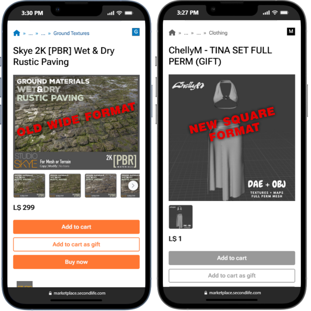
The lower text on both of these items is too small to read on a phone. The older wide format loses a lot of image space compared to the new square format.
Step 2: Optimize Product Thumbnails
- Marketplace now prioritizes thumbnails more heavily in search results, especially on mobile.
- Use square, centered images — avoid wide banners or cropped shots.
- Keep the main product clearly visible without zooming.
- Add a subtle border or neutral background if your product is hard to distinguish on white/gray.

Step 3: Rewrite Product Titles & Keywords
- Mobile shows fewer characters in product titles before cutting off.
- Keep titles short, descriptive, and front-loaded (e.g., “Men’s Leather Jacket – Black” vs. “New Release: High-Quality Black Leather Jacket for Men”).
- Check category/subcategory labels — some have been renamed or reorganized in the redesign.
- Refresh keywords to match current search behavior.
📋 Checklist For Merchants:
- Trim titles to 60–70 characters max.
- Put the most important words first.
- Re-check category placement after redesign.
- Add 2–3 new relevant keywords.
Step 4: Revamp Descriptions for Mobile Readers
- Mobile users scan quickly.
- Use short paragraphs, bullet points, and spacing.
- Put essential info (permissions, size, compatibility) at the top.
- Link to related products near the end.
📸 Screenshot idea: Before/after example of a long block of text vs. a clean, bullet-pointed description.
Step 5: Store Banner & Branding
- Store banners now shrink differently on mobile.
- Test your banner on a phone — is text readable, or is it cut off?
- Consider a simplified logo version for branding.
📋 Quick Banner Test:
- Text readable on a 5-inch screen.
- No clutter or small details.
- Consistent colors with product thumbnails.
Step 6: Review Transaction & Delivery Settings
With Marketplace bugs recently causing duplicate subscription charges, now is a good time to double-check your store’s financial settings.
- Verify subscription settings in your Merchant Dashboard.
- Review recent transactions and note any anomalies.
- Keep support ticket numbers handy in case of issues.
Step 7: Ask for Feedback
- Invite a few customers or friends to browse your store on their phones.
- Ask: Was it easy to find items? Did images load clearly? Were descriptions easy to skim?
- Adjust based on real-world input.
Merchant’s Mobile-Ready Checklist
✅ Thumbnails are square, clean, and centered
✅ Titles under 70 characters, keywords refreshed
✅ Descriptions use bullets and short paragraphs
✅ Store banner readable on mobile
✅ Categories double-checked
✅ Transactions reviewed
✅ Customer feedback gathered
Why This Matters
The Marketplace is the lifeblood of Second Life’s economy. A polished, mobile-friendly storefront doesn’t just look professional — it directly impacts your sales and discoverability. With Linden Lab’s redesign putting mobile at the center, merchants who adapt fastest will be the ones most likely to benefit.


